PRACTICE QUESTIONS USING BAR GRAPH
Subscribe to our ▶️ YouTube channel 🔴 for the latest videos, updates, and tips.
Problem 1 :
The number of bed sheets manufactured by a factory during five consecutive weeks is given below.
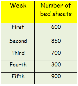
Draw the bar graph representing the above data.
Problem 2 :
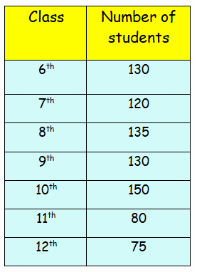
Draw the bar graph representing the above data.
Problem 3 :
The number of absentees in class VIII was recorded in a particular week. Represent this data on the bar graph
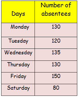
(a) On which day the maximum and minimum students were absent?
(b) How many students were absent on Wednesday and Friday?
(c) On which days the same number of students was absent?
Problem 4 :
The number of trees planted by Eco-club of a school in different years is given below.
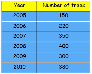
Draw the bar graph to represent the data.
Problem 5 :
A randomly selected sample of small businesses has been asked, “How many full-time employees are there in your business?”. A column graph has been constructed for the results.
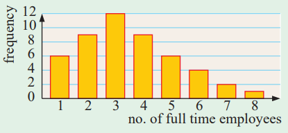
a) How many small businesses gave data in the survey?
b) How many of the businesses had only one or two full-time employees?
c) What percentage of the businesses had five or more full-time employees?
Problem 6 :
There are five entry gates at an open air concert. This bar chart shows how many people went through each gate.

a) How many more people went through gate C than gate D?
b) How many gates had fewer than 150 people go through?
Problem 7 :
Class 6 did a survey of their favorite types of story book. Here are their results.

a) How many more children chose adventure books than fantasy books?
b) Five girls chose animal books. How many boys chose animal books?
Problem 8 :
Tom does a survey of children’s favourite breakfast cereals. These are the results for Class 6

Problem 9 :
How many more children in class 6 prefer Choc Grain than Golden Corn ?

How many children in both classes like Honey Bites best?
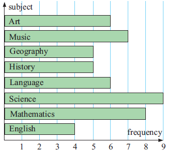
Problem 1 :
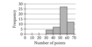
50 randomly selected students were asked to name their favorite subject at school. The results of the survey are displayed in the graph.
a) What sort of graph is being used?
b) Which was the most favored subject?
c) How many students chose Art as their favorite subject?
d) What percentage of the students named Mathematics as their favorite subject?
e) What percentage of the students chose either History or English as their favorite subject?
Problem 2 :
In an English middle school, 80 students were asked to name their favorite fruit. The following data was collected :
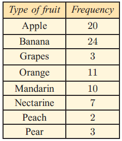
a) Construct a vertical column graph to illustrate this data.
b) For this group of students, which was the most favored fruit?
c) Can we make conclusions about the favorite fruit of all middle school students from this survey? Give a reason for your answer.
Problem 3 :
A randomly selected sample of adults was asked to name the evening television news service that they watched. The following results were obtained:
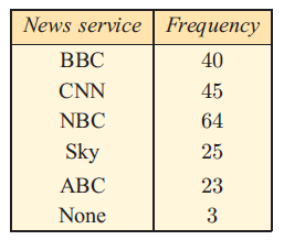
a) How many adults were surveyed?
b) Which news service is the most popular?
c) What percentage of those surveyed watched the most popular news service?
d) What percentage of those surveyed watched CNN?
e) Draw a horizontal bar chart to display the data.
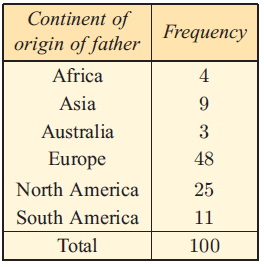
Problem 4 :
100 randomly selected students at an international school were asked to indicate the continent of origin of their father. The data collected has been organized into the following frequency table.
a) Display this data using a segmented bar chart.
b) What percentage of the sample had fathers who were born outside Europe?
Problem 5 :
During the 2008 season Emma was very successful at scoring goals for her field hockey team. In fact on one occasion she scored 7 goals in a match. Her goal scoring results are illustrated on the graph.
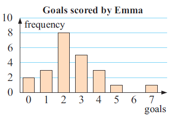
a) How many games did Emma play?
b) On how many occasions did she score 4 or more goals?
c) In what percentage of games did she score:
i) less than 2 goals ii) more than 4 goals?
Problem 6 :
The bar graph shows the results of a survey of 50 seventh graders about their favorite ice cream topping.

Based on the graph, what percentage of seventh graders prefer sprinkles or chocolate chips as an ice cream topping?
A) 20% B) 64% C) 18% D) 36%
Problem 7 :
Maribel surveyed 55 people to find out their favorite types of music. The results are shown in the bar graph.

Based on the information in the graph, which types of music were chosen by 40% of the people surveyed?
A) Country and opera B) Jazz and opera
C) Jazz, opera, and rock D) Country, jazz, and rock
Problem 1 :
The total number of runs scored by few players in one-day match is given in the bar graph.

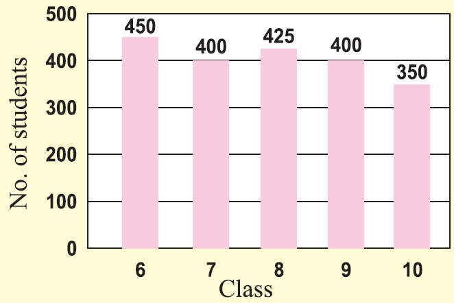
Problem 2 :
The number of students in each class of a school is given in the bar graph.
Problem 3 :
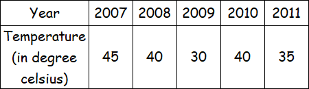
The average temperature during the month of April in a city during the year 2007 to 2012 is given. Draw bar graph for the data.
Subscribe to our ▶️ YouTube channel 🔴 for the latest videos, updates, and tips.
Kindly mail your feedback to v4formath@gmail.com
We always appreciate your feedback.
About Us | Contact Us | Privacy Policy
©All rights reserved. onlinemath4all.com

Recent Articles
-
SAT Math Practice Problems with Answers
May 21, 26 01:17 AM
 SAT Math Practice Problems with Answers
 -
Digital SAT Math Questions and Answers (Part - 13)
May 17, 26 09:03 AM
 Digital SAT Math Questions and Answers (Part - 13)
 -
Problems on Solving Logarithmic Equations
Apr 24, 26 09:30 PM
Problems on Solving Logarithmic Equations