SCATTER PLOTS AND ASSOCIATION WORKSHEET
Subscribe to our ▶️ YouTube channel 🔴 for the latest videos, updates, and tips.
Problem 1 :
The final question on a science test reads, how many hours spent studying for this test. The teacher records the number of hours each student studied and the marks scored by the respective student on the test.
Hours Spent for Studying
0
0.5
1
1
1.5
1.5
2
3
4
Marks Scored by the Students
75
80
80
85
85
95
90
100
90
Describe the type of association between number of hours spent for studying and marks scored using scatter plot.
Problem 2 :
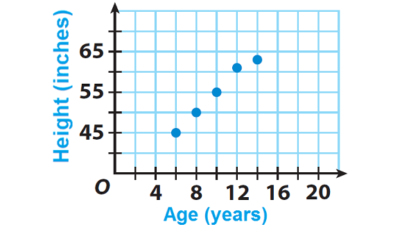
The scatter plot shows David’s height at various ages. Describe the type of association between David’s age and his height. Explain.
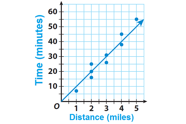
Problem 3 :
Alexa is training for a 10K race. For each of her training runs, she recorded the distance she ran and the time she ran. She made a scatter plot of her data and drew a trend line. Use the trend line to predict how long it would take Alexa to run 4.5 miles.
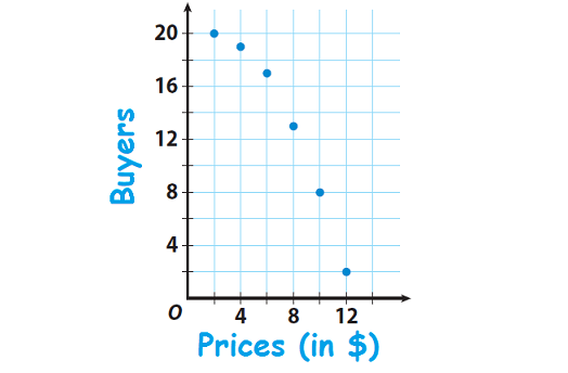
Problem 4 :
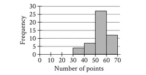
David asked 20 people if they can buy a new product that he developed at each of several prices. The scatter plot shows how many of the 20 people said “yes” at a given price. Describe the association between price and the number of buyers.
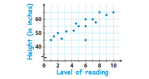
Problem 5 :
A survey made among students in a district and the scatter plot shows the level of reading and height for 16 students in the district. Describe the association and give a possible reason for it.
Problem 6 :
Identify the data sets as having a positive, a negative, or no correlation.
a) The number of hours a person has driven and the number of miles driven
b) The number of siblings a student has and the grade they have in math class
c) The age of a car and the value of the car
d) The number of weeks a CD has been out and the total sales
e) The number of years a person went to school and their income
f) The number of songs downloaded on your i-pod and the amount of memory available
g) The amount of time spent on the computer instant messaging your friends and the number of computers in your house
h) The age of a house and the number of people living in the house

1. Answer :
Hours Spent for Studying
0
0.5
1
1
1.5
1.5
2
3
4
Marks Scored by the Students
75
80
80
85
85
95
90
100
90
Step 1 :
Make a prediction about the relationship between the number of hours spent studying and marks scored.
When we look at the above data, we can make the following prediction. A greater number of study hours are likely to be associated with higher marks.
Step 2 :
Make a scatter plot. Graph hours spent studying as the independent variable and marks scored by the students as the dependent variable.
Moreover, if we consider hours spent for studying as variable "x" and marks scored by the students as variable "y", we can write the above data as ordered pairs in the form (x, y).
Then, we have
(0, 75), (0.5, 80), (1, 80), (1, 85), (1.5, 85), (1.5, 95), (2, 90), (3, 100) and (4, 90).
Plot these points on a graph paper.
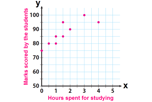
The graph shows a general upward trend. So the association between number of hours spent for studying and marks scored is positive. That is, as number of hours is getting increased, the marks scored is also getting increased.
2. Answer :
As David is getting older, his height increases roughly along a straight line on the graph, so the association is positive and basically linear.
3. Answer :
For a distance of 4.5 miles, the trend line shows a time of 45 minutes. So, it will take Alexa about 45 minutes to run 4.5 miles.
4. Answer :
When price gets increased, the number of buyers gets decreased. So, there is a negative association. Because the data points do not lie along a line, the association is non-linear.
5. Answer :
Positive and basically linear :
The students who are taller read at a higher level.
6. Answer :
a) Let x be the number number of hours driven and y be the number of miles covered.
When time taken increases then the distance covered will also increase, hence it is positive correlation.
b) Let x be the number fo sibling and y be the grade he has in math class.
Since there is no relationship between the number of sibling he has and grade he is recieving in math class. So, there in no correlation.
c) Let x be the age of car and y be the value of car.
Based on the depriciation of product the value of the car will reduce. Then it is negative correlation.
d) Let x be the number of weeks a CD has been out and y be the total sales.
Then, it is positive correlation.
e) Let x be the number of years a person went to school and y be their income.
Then, it is positive correlation.
f) Let x be the number of songs downloaded and y be amont of memory available.
When download increases the memory will decrease. Then, it is negative correlation.
g) There is no correlation.
h) There is no relationship between age of house and number of people livining in the house, there is no correlation.
Subscribe to our ▶️ YouTube channel 🔴 for the latest videos, updates, and tips.
Kindly mail your feedback to v4formath@gmail.com
We always appreciate your feedback.
About Us | Contact Us | Privacy Policy
©All rights reserved. onlinemath4all.com

Recent Articles
-
AP Calculus AB Problems with Solutions (Part - 1)
May 29, 26 09:41 PM
 AP Calculus AB Problems with Solutions (Part - 1)
 -
SAT Math Practice Problems with Answers
May 21, 26 01:17 AM
 SAT Math Practice Problems with Answers
 -
Digital SAT Math Questions and Answers (Part - 13)
May 17, 26 09:03 AM
 Digital SAT Math Questions and Answers (Part - 13)