READING BAR GRAPHS
Subscribe to our ▶️ YouTube channel 🔴 for the latest videos, updates, and tips.
We consider Multiple or Grouped Bar diagrams to compare related series. Component or sub-divided Bar diagrams are applied for representing data divided into a number of components. Finally, we use Divided Bar charts or Percentage.
Bar diagrams for comparing different components of a variable and also the relating of the components to the whole. For this situation, we may also use Pie chart or Pie diagram or circle diagram.
Example 1 :
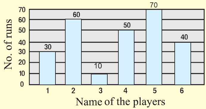
The total number of runs scored by few players in one-day match is given in the bar graph.
Question :
Which player did score the maximum runs ?
Answer :
When read the above bar graph, it is clear that player no.5 scored the maximum runs. That is 70.
Question :
What is the ratio between the runs scores by player 2 and player 5 ?
Answer :
Player 2 : Player 5 = 60 : 70
= 6 : 7
Question :
What is the difference between the runs scored by player 1 and 4 ?
Answer :
Difference = |60 - 50| = 10
Question :
What percentage of runs did player 5 score more than player 4 ?
Answer :
Difference between the runs scored by player 4 and 5 is
= 70 - 50
= 20
Required percentage = (20/50) x 100%
= 40 %
Example 2 :
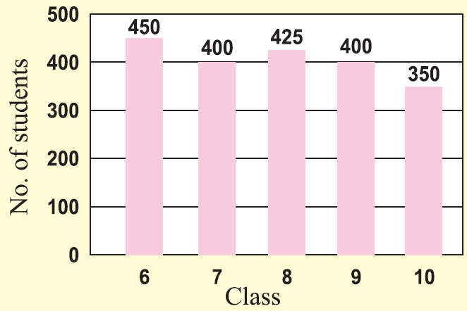
The number of students in each class of a school is given in the bar graph.
Question :
In which class, is the student strength maximum ?
Answer :
When read the above bar graph, it is clear that the class 6 has the maximum strength. That is 450.
Question :
What is the ratio between the strengths of class 9 and class 10 ?
Answer :
Class 9 : Class 10 = 400 : 350 = 8 : 7
Question :
What is the difference between the strengths in class 8 and class 10 ?
Answer :
Difference = |425 - 350| = 75
Question :
What percentage of strength does class 6 have more than class 7 ?
Answer :
Difference between the strengths in class 6 and class 7 is
= 450 - 400
= 50
Required percentage = (50/400) x 100%
= 12.5%
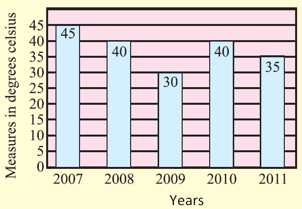
Example 3 :
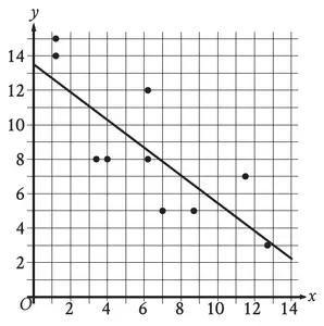
The average temperature during the month of April in a city during the year 2007 to 2012 is given. Draw bar graph for the data.
Solution :
Example 4 :
Mr. Kumar conducted a random survey asking 80 students which elective class they prefer. The results are shown in the bar graph.

Which inference about the data is best supported by this information?
A) More eighth-grade students prefer art as an elective than prefer band or theater.
B) Fewer seventh-grade students prefer band or theater as an elective than prefer art.
C) Half as many seventh-grade students as eighth-grade students prefer theater as an elective.
D) Twice as many seventh-grade students as eighth-grade students prefer band as an elective.
Solution :
Option A :
Number of eight grade students prefer art = 20
Number of eight grade students prefer theater = 14
Number of eight grade students perfer band = 6
20 = 14 + 6
20 = 20
Both are equal.
Option B :
Number of seventh grade students who prefer band or theater
= 12 + 8
= 20
Number of seventh grade students who prefer art = 20
Both are equal.
Option C :
Number of seventh grade students who theater = 8
Number of eight grade students who theater = 14
8 is not half of 14.
Option D :
Number of seventh grade students prefer band = 12
Number of eight grade students prefer band = 6
Option D is correct.
Example 5 :
The bar graph shows the results of a survey of 50 seventh graders about their favorite ice cream topping.

Based on the graph, what percentage of seventh graders prefer sprinkles or chocolate chips as an ice cream topping?
A) 20% B) 64% C) 18% D) 36%
Solution :
Number of students who prefer
Sprinkles = 10
Chocolate chips = 8
Wafflane cone pieces = 5
Whipped cream = 9
Wainuts = 7
Brownie bits = 11
Number of students who prefer sprinkles or chocolate chips as an ice cream topping = 10 + 8
= 18
Percentage = (18/50) x 100%
= 0.36 x 100%
= 36%
So, option D is correct.
Example 6 :
Students were surveyed to determine their favorite types of animals. The bar graph shows the number of students who selected each type of animal.

What percentage of the students surveyed selected “Bird” as their favorite type of animal?
A) 20% B) 5% C) 6% D) 80%
Solution :
- Number of students who select Fishes = 2
- Number of students who select Lizards = 4
- Number of students who select Birds = 6
- Number of students who select Dogs = 10
- Number of students who select Cats = 8
Total number of students = 2 + 4 + 6 + 10 + 8
= 30
Percentage of students who select birds = (6/30) x 100%
= (1/5) x 100%
= 20%
So, option A is correct.
Subscribe to our ▶️ YouTube channel 🔴 for the latest videos, updates, and tips.
Kindly mail your feedback to v4formath@gmail.com
We always appreciate your feedback.
About Us | Contact Us | Privacy Policy
©All rights reserved. onlinemath4all.com

Recent Articles
-
Digital SAT Math Questions and Answers (Part - 13)
Apr 19, 26 09:23 AM
Digital SAT Math Questions and Answers (Part - 13) -
Digital SAT Math Practice Test with Answers (Part - 2)
Apr 13, 26 06:21 PM
 Digital SAT Math Practice Test with Answers (Part - 2)
 -
SAT Math Resources (Videos, Concepts, Worksheets and More)
Apr 09, 26 07:46 PM
SAT Math Resources (Videos, Concepts, Worksheets and More)