LOOKING AT DATA SETS
Subscribe to our ▶️ YouTube channel 🔴 for the latest videos, updates, and tips.
We will be able to describe a data distribution, or how data values are arranged, by looking at its overall shape, its center, and its least and greatest values.
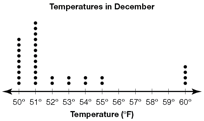
By looking at this dot plot, we will be able to describe the data distribution as being spread out to the right and not symmetric.
The data is grouped between 50 and 51, and there is a gap between 55 and 60. The center of the data can be found by looking for the middle number in the largest group of data. A good estimate would be 50 or 51 because that is where most of the temperatures are plotted.
Example 1 :
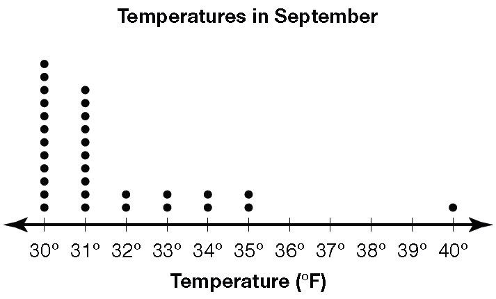
Use the dot plot shown below to answer the questions 1 to 5.
Questions :
1. What is the least temperature? Greatest temperature?
2. Are there any gaps in the data? If so, where?
3. What temperature would be considered an outlier?
4. Is the data symmetric or spread out to one side?
5. Writing to Explain. Where do you think the center of the data is in the dot plot? Explain how you found your answer.
Answers :
1. 30°F; 40°F
2. Yes; Between 35°F and 40°F
3. 40°F
4. The data is spread out to the right.
5. The center of the data is about 31°F. Most of the data is grouped on the left side of the distribution.
Example 2 :
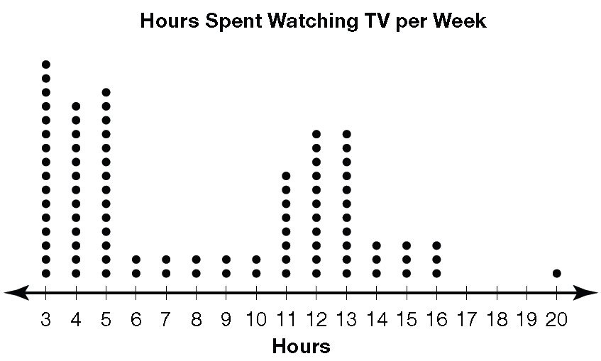
Use the dot plot shown below to answer the questions 6 to 9.
Maria took a school survey to find out how many hours per week students watch television. Her results are in the dot plot below.
Questions :
6. Where are there groupings of data?
7. Is the data symmetric or is it spread out to one side?
8. Give the least and greatest values in the data.
9. Writing to Explain. Using the dot plot for the hours students spend watching TV, where do you think the center of the data is?
Answers :
6. From 3–5 hours and from 11–16 hours.
7. The data is spread out more to the right than to the left.
8. Least: 3; Greatest: 20
9. The center is about 7 hours. More data is on the left so the center is closer to that side.
Example 3 :
Use the dot plot shown below to answer the questions 10 and 11.
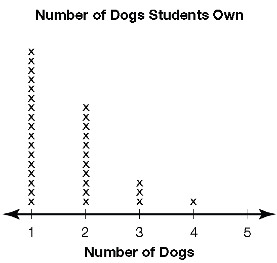
Questions :
10. Which is the best representation of the center of this data set?
(a) 2
(b) 3
(c)4
(d) 5
11. Which best describes this data set?
(a) Spread out to the left
(b) No noticeable shape
(c) Spread out to the right
(d) Symmetric
Answers :
10. (a) 2
11. (c) Spread out to the right
Subscribe to our ▶️ YouTube channel 🔴 for the latest videos, updates, and tips.
Kindly mail your feedback to v4formath@gmail.com
We always appreciate your feedback.
About Us | Contact Us | Privacy Policy
©All rights reserved. onlinemath4all.com

Recent Articles
-
10 Hard SAT Math Questions (Part - 45)
Jan 19, 26 06:14 AM
 10 Hard SAT Math Questions (Part - 45)
 -
10 Hard SAT Math Questions (Part - 44)
Jan 12, 26 06:35 AM
10 Hard SAT Math Questions (Part - 44) -
US Common Core K-12 Curricum Algebra Solving Simple Equations
Jan 07, 26 01:53 PM
US Common Core K-12 Curricum Algebra Solving Simple Equations