GRAPHICAL REPRESENTATION OF DATA
Subscribe to our ▶️ YouTube channel 🔴 for the latest videos, updates, and tips.
An attractive representation of a frequency distribution is graphical representation.
Graphical representation can be used for both the educated section and uneducated section of the society. Furthermore, any hidden trend present in the given data can be noticed only in this mode of representation.
We are going to consider the following types of graphical representation :
1. Line diagram
2. Histogram
3. Bar diagram
4. Pie chart
5. Frequency polygon
6. Ogives or Cumulative frequency graphs
Line diagram
When the time series exhibit a wide range of fluctuations, we may think of logarithmic or ratio chart where "Log y" and not "y" is plotted against "t".
We use Multiple line chart for representing two or more related time series data expressed in the same unit and multiple – axis chart in somewhat similar situations, if the variables are expressed in different units.
Example 1 :
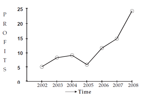
The profits in thousand of dollars of an industrial house for 2002, 2003, 2004, 2005, 2006, 2007 and 2008 are 5, 8, 9, 6, 12, 15 and 24 respectively. Represent these data using a suitable diagram.
Solution :
We can represent the profits for 7 consecutive years by drawing either a line diagram as given below.
Let us consider years on horizontal axis and profits on vertical axis.
For the year 2002, the profit is 5 thousand dollars. It can be written as a point (2002, 5)
In the same manner, we can write the following points for the succeeding years.
(2003, 8), (2004, 9), (2005, 6), (2006, 12), (2007, 15) and (2008, 24)
Now, plotting all these point and joining them using ruler, we can get the line diagram.
Showing line diagram for the profit of an Industrial House during 2002 to 2008.
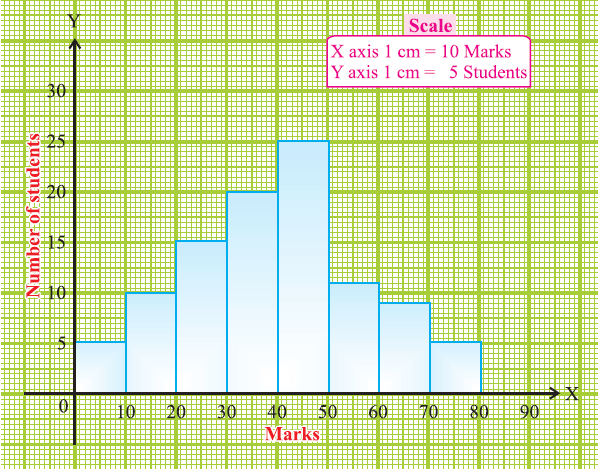
Histogram
A two dimensional graphical representation of a continuous frequency distribution is called a histogram.
In histogram, the bars are placed continuously side by side with no gap between adjacent bars.
That is, in histogram rectangles are erected on the class intervals of the distribution. The areas of rectangle are proportional to the frequencies.
Example 2 :
Draw a histogram for the following table which represent the marks obtained by 100 students in an examination :
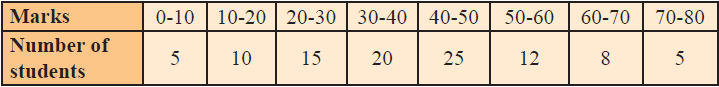
Solution :
The class intervals are all equal with length of 10 marks.
Let us denote these class intervals along the X-axis.
Denote the number of students along the Y-axis, with appropriate scale.
The histogram is given below.
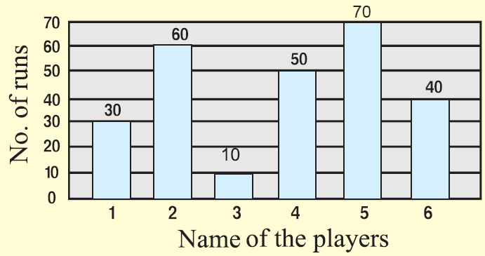
Bar diagram
There are two types of bar diagrams namely, Horizontal Bar diagram and Vertical bar diagram.
While horizontal bar diagram is used for qualitative data or data varying over space, the vertical bar diagram is associated with quantitative data or time series data.
Bars i.e. rectangles of equal width and usually of varying lengths are drawn either horizontally or vertically.
We consider Multiple or Grouped Bar diagrams to compare related series. Component or sub-divided Bar diagrams are applied for representing data divided into a number of components. Finally, we use Divided Bar charts or Percentage
Bar diagrams for comparing different components of a variable and also the relating of the components to the whole. For this situation, we may also use Pie chart or Pie diagram or circle diagram.
Example 3 :
The total number of runs scored by a few players in one-day match is given.
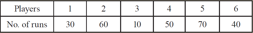
Solution :
Draw bar graph for the above data.
Pie chart
In
a pie chart, the various observations or components are represented by
the sectors of a circle and the whole circle represents the sum of the
value of all the components .Clearly, the total angle of 360° at the
center of the circle is divided according to the values of the
components .
The central angle of a component is
= [Value of the component/Total value] x 360°
Sometimes, the value of the components are expressed in percentages. In such cases,
The central angle of a component is
= [Percentage value of the component/100] x 360°
Example 4 :
The number of hours spent by a school student on various activities on a working day, is given below. Construct a pie chart using the angle measurement.
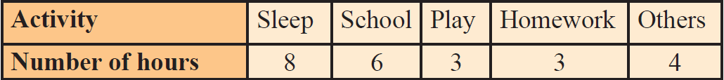
Draw a pie chart to represent the above information.
Solution :
The central angle of a component is
= [Value of the component/Total value] x 360°
We may calculate the central angles for various components as follows :
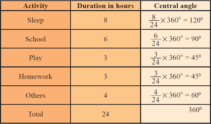
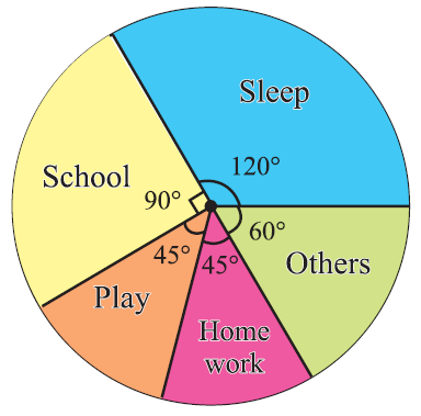
From the above table, clearly, we obtain the required pie chart as shown below.
Frequency polygon
Frequency Polygon is another method of representing frequency distribution graphically.
Obtain the frequency distribution and compute the mid points of each class interval.
Represent the mid points along the X-axis and the frequencies along the Y-axis.
Plot the points corresponding to the frequency at each mid point.
Join these points, by straight lines in order.
To complete the polygon join the point at each end immediately to the lower or higher class marks (as the case may be at zero frequency) on the X-axis.
Example 5 :
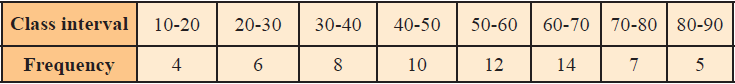
Draw a frequency polygon for the following data without using histogram.
Solution :
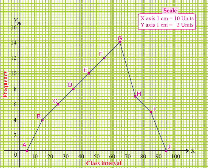
Mark the class intervals along the X-axis and the frequency along the Y-axis.
We take the imagined classes 0-10 at the beginning and 90-100 at the end, each with frequency zero.
We have tabulated which is given below.
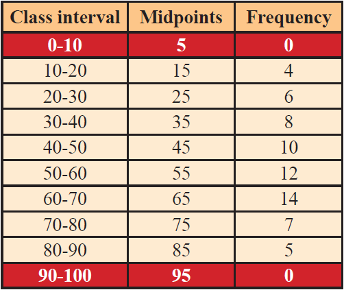
Using the adjacent table, plot the points A (5, 0), B (15, 4), C (25, 6), D (35, 8), E (45, 10), F (55, 12), G (65, 14), H (75, 7), I (85, 5) and J (95, 0).
We draw the line segments AB, BC, CD, DE, EF, FG, GH, HI, IJ to obtain the required frequency polygon ABCDEFGHIJ, which is given below.
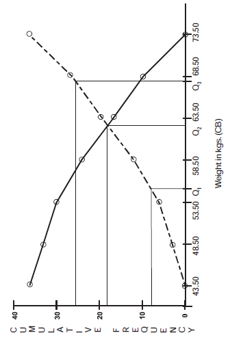
Ogives or Cumulative frequency graphs
By plotting cumulative frequency against the respective class boundary, we get ogives.
As such there are two ogives – less than type ogives, obtained by taking less than cumulative frequency on the vertical axis and more than type ogives by plotting more than type cumulative frequency on the vertical axis and thereafter joining the plotted points successively by line segments.
Example 6 :
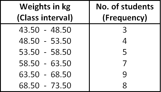
Draw ogives for the following table which represents the frequency distribution of weights of 36 students.
Solution :
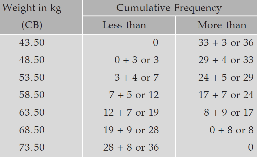
To draw ogives for the above frequency distribution, we have to write less than and more than cumulative frequency as given below.
Now, we have to write the points from less than and more than cumulative frequency as given below.
Points from less than cumulative frequency :
(43.50, 0), (48.50, 3), (53.50, 7), (58.50, 12), (63.50, 19), (68.50, 28) and (73.50, 36)
Points from more cumulative frequency :
(43.50, 36 (48.50, 33), (53.50, 29), (58.50, 24), (63.50, 17), (68.50, 8) and (73.50, 0)
Now, taking frequency on the horizontal axis, weights on vertical axis and plotting the above points, we get ogives as given below.
Subscribe to our ▶️ YouTube channel 🔴 for the latest videos, updates, and tips.
Kindly mail your feedback to v4formath@gmail.com
We always appreciate your feedback.
About Us | Contact Us | Privacy Policy
©All rights reserved. onlinemath4all.com

Recent Articles
-
Digital SAT Math Problems and Solutions (Part -27)
Feb 28, 26 07:46 PM
 Digital SAT Math Problems and Solutions (Part -27)
 -
Digital SAT Math Problems and Solutions (Part - 26)
Feb 28, 26 06:28 PM
 Digital SAT Math Problems and Solutions (Part - 26)
 -
Digital SAT Math Problems and Solutions (Part - 25)
Feb 28, 26 07:21 AM
 Digital SAT Math Problems and Solutions (Part - 25)