MAKING A SCATTER PLOT
Subscribe to our ▶️ YouTube channel 🔴 for the latest videos, updates, and tips.
We know that a set of bivariate data involves two variables. Bivariate data can be used to explore the relationship between two variables. We can graph bivariate data on a scatter plot. A scatter plot is a graph with points plotted to show the relationship between two variables or two sets of data.
Example 1 :
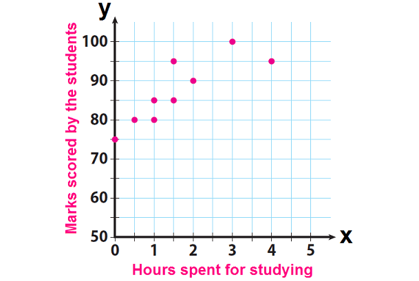
The final question on a science test reads, how many hours we spent studying for this test. The teacher records the number of hours each student studied and the marks scored by the respective student on the test.
Hours Spent for Studying
0
0.5
1
1
1.5
1.5
2
3
4
Marks Scored by the Students
75
80
80
85
85
95
90
100
90
Solution :
Step 1 :
Make a prediction about the relationship between the number of hours spent studying and marks scored.
When we look at the above data, we can make the following prediction. A greater number of study hours are likely to be associated with higher marks.
Step 2 :
Make a scatter plot. Graph hours spent studying as the independent variable and marks scored by the students as the dependent variable.
Moreover, if we consider hours spent for studying as variable "x" and marks scored by the students as variable "y", we can write the above data as ordered pairs in the form (x, y).
Then, we have
(0, 75), (0.5, 80), (1, 80), (1, 85), (1.5, 85), (1.5, 95), (2, 90), (3, 100) and (4, 90).
Plot these points on a graph paper.
Reflect
1. What trend can we see in the data ?
In general, when students increase the number of study hours, the marks scored by them are also getting increased.
2. Can we conclude the grade associated with studying for 10 hours would follow this trend ?
No
The graph shows a general upward trend, but the marks scored by the students cannot exceed 100.
3. Can we say this relationship as positive or negative ?
Positive
Because, when one variable (x) is increased, the other variable (y) is also getting increased.
Example 2 :
The table below shows the number of prom tickets sold over a ten-day period.

Plot these data points on the coordinate grid below. Use a consistent and appropriate scale. Draw a reasonable line of best fit and write its equation.
Solution :
Let x be the number of days and y be the number of porm tickets sold.

Plotting these points in the graph paper, we get the above graph.
Choosing two point closer to the line of best fit, (1, 30) and (2, 35)
Slope = (y2 - y1)/(x2 - x1)
= (35 - 30) / (2 - 1)
= 5
Line of best fit :
y = mx + b
y = 5x + 28
Example 3 :
Megan and Bryce opened a new store called the Donut Pit. Their goal is to reach a profit of $20,000 in their 18th month of business. The table and scatter plot below represent the profit, P, in thousands of dollars, that they made during the first 12 months.


Draw a reasonable line of best fit. Using the line of best fit, predict whether Megan and Bryce will reach their goal in the 18th month of their business. Justify your answer.
Solution :

They will not reach their goal in 18 months.
Example 3 :
Bob recorded his height at different ages. The table below shows his data

a) Make a scatter plot of Bob’s data
b) Describe the association between Bob’s age and his height. Explain the association.
Solution :
Here x represents age in years and y represents height in inches.

b) When age increases height is also increasing, then it is positive correlation.
Example 4 :
The scatter plot shows the basketball shooting results for 14 players. Describe any clusters you see in the scatter plot. Identify any outliers

Solution :
In a scatter plot where data points form distinct groups or concentrations, indicating a relationship or pattern within the data.
Cluster :
Yes, there are 2 clusters we see in the scatter plot. In between 5 to 15 we have a cluster and in between 18 to 25 we have another one.
Outlier :
There is one outlier. The point that the outlier is (35, 18).
Example 5 :
Olympic Men’s Long Jump Winning Distances

a) Describe the association between the year and the distance jumped for the years 1960 to 1988.
b) Describe the association between the year and the distance jumped for the years after 1988.
c) For the entire scatter plot, is the association between the year and the distance jumped linear or nonlinear?
d) Identify the outlier and interpret its meaning.
Solution :
a) Distance jumped from 1960 to 1988, we have positive association.
b) After 1988, the relatiohsip says negative assosication.
c) The line of best fit cannot be a straight line and it is curved. So, it is not a linear and it is non linear.
d) At 1968, the distance jumped is 8.9 m.
Example 6 :

The scatter plot above shows the perimeters and areas of 10 rectangles. What is the perimeter, in centimeters, of the rectangle represented by the data point that is farthest from the line of best fit (not shown)?
a) 12 b) 17 c) 20 d) 23
Solution :
The farthest point from line of best fit is (23, 30). So, option d is correct.
Subscribe to our ▶️ YouTube channel 🔴 for the latest videos, updates, and tips.
Kindly mail your feedback to v4formath@gmail.com
We always appreciate your feedback.
About Us | Contact Us | Privacy Policy
©All rights reserved. onlinemath4all.com

Recent Articles
-
AP Calculus AB Problems with Solutions (Part - 1)
May 29, 26 09:41 PM
 AP Calculus AB Problems with Solutions (Part - 1)
 -
SAT Math Practice Problems with Answers
May 21, 26 01:17 AM
 SAT Math Practice Problems with Answers
 -
Digital SAT Math Questions and Answers (Part - 13)
May 17, 26 09:03 AM
 Digital SAT Math Questions and Answers (Part - 13)