LINE DIAGRAM IN STATISTICS
Subscribe to our ▶️ YouTube channel 🔴 for the latest videos, updates, and tips.
When the data vary over time, we take recourse to line diagram. In a simple line diagram, we plot each pair of values of (t, y), "y" representing the time series at the time point t in the "t–y" plane.
The plotted points are then joined successively by line segments and the resulting chart is known as line-diagram.
Line Diagram
When the time series exhibit a wide range of fluctuations, we may think of logarithmic or ratio chart where "Log y" and not "y" is plotted against "t".
We use Multiple line chart for representing two or more related time series data expressed in the same unit and multiple – axis chart in somewhat similar situations, if the variables are expressed in different units.
Example 1 :
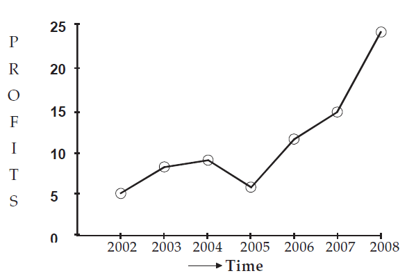
The profits in thousand of dollars of an industrial house for 2002, 2003, 2004, 2005, 2006, 2007 and 2008 are 5, 8, 9, 6, 12, 15 and 24 respectively. Represent these data using a suitable diagram.
Solution :
We can represent the profits for 7 consecutive years by drawing either a line diagram as given below.
Let us consider years on horizontal axis and profits on vertical axis.
For the year 2002, the profit is 5 thousand dollars. It can be written as a point (2002, 5)
In the same manner, we can write the following points for the succeeding years.
(2003, 8), (2004, 9), (2005, 6), (2006, 12), (2007, 15) and (2008, 24)
Now, plotting all these point and joining them using ruler, we can get the line diagram.
Showing line diagram for the profit of an Industrial House during 2002 to 2008.
Example 2 :
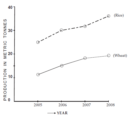
The production of wheat and rice of a region are given below :
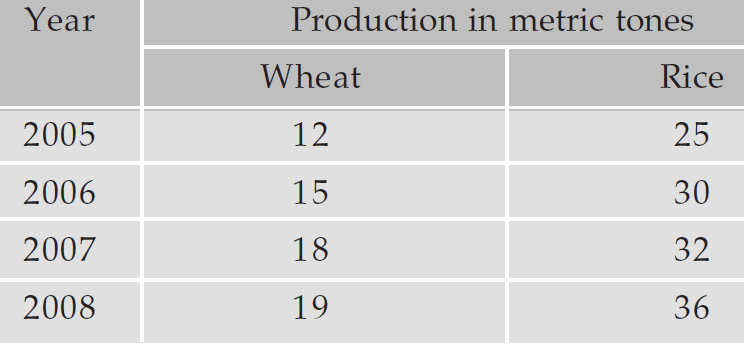
Represent the information given using a suitable diagram.
Solution :
We can represent this information by drawing a multiple line chart. Alternately, a multiple bar diagram may be considered. These are depicted in the figure given below.
Multiple line chart showing production of wheat and rice of a region during 2005–2008.
(Dotted line represent production of rice and continuous line that of wheat).
Example 3 :

Use the temperature-time graph to find :
a) the temperature at 10 am
b) the times when the temperature was 25oC
c) the periods when the temperature was:
i increasing ii decreasing
d) the maximum temperature and when it occurred.
Solution :
a) The temperature at 10 am was 30oC.
b) The temperature was 25oC at 8 am, 6 pm and 10 pm.
c) The temperature was:
i) increasing from midnight to 2 pm and from 8 pm to 10 pm
ii) decreasing from 2 pm to 8 pm and from 10 pm to midnight.
d) The maximum temperature was 35oC at 2 pm.
Example 4 :

Sally recorded the number of cars in a car park every two hours. She begun at 9 am and finished at 7pm. The line graph shows her results.
(a) When were the most cars in the car park?
(b) How many cars were in the car park at 11 am?
(c) At what time were there 24 cars in the car park?
(d) Estimate the number of cars in the car park at 10am.
(e) How many less cars were in the car park at 3pm than 1pm?
Solution :
By looking at the graph,
x - axis = time
y - axis = frequency
a) By observing the line graph above, at 1 pm there is more number of cars in the car park.
b) The point (11, 80) shows that there is 80 cars at 11 am.
c) At 5 pm, there were 24 cars.
d) At 10 am, there were 60 cars.
e) At 3 pm, there is 62 cars. At 1 pm, there is 90 cars. The difference is 90 - 62, which is 18. So, there is 18 less number of cars are there at 1 pm.
Example 5 :
The line graph below shows the cost of a coffee in a shop over 30 years.

(a) In which year was the price £2.50?
(b) How much was the price of a coffee in 1990?
(c) Estimate the price of a coffee in 2005. Carlos says that the price of a coffee will be £3.60 by 2020.
(d) Do you agree with Carlos? Explain your answer.
Solution :
(a) In the year 2000, the price is £2.50
(b) At 1990, the price is £1.50
(c) The price of coffee at 2005 is £2.80.
(d) By observing the graph and analyzing the information above, every year the price is increasing, so there is the chance to have the price £3.60 at 2020.
Example 6 :
The following graph shows the journey made by two cyclists, one from townA to B and other from B to A.

(a) At what time did cyclist II rest? How long did the cyclist rest ?
(b) Was cyclist II cycling faster or slower after the rest ?
(c) At what time did the two cyclists meet?
Solution :
a) Cyclist II 2 ends at 10 am, the time duration is 2 hours.
b) The graph shows, the cyclist II is faster after the rest.
c) The two cyclist meets at 9 am.
Example 7 :
Read the following graph and answer the questions given below:

(a) At what time temperature was maximum?
(b) What is the temperature at 6 PM?
(c) What is the temperature difference between time 6:00 AM and 6:00 PM?
Solution :
a) At 10 am, the temperature is maximum.
b) At 6 am, the temperature is 370 C
c) AT 6 am, the temperature is 370 C and at 6 pm, the temperature is 350 C. The difference is 20 C.
Subscribe to our ▶️ YouTube channel 🔴 for the latest videos, updates, and tips.
Kindly mail your feedback to v4formath@gmail.com
We always appreciate your feedback.
About Us | Contact Us | Privacy Policy
©All rights reserved. onlinemath4all.com

Recent Articles
-
Digital SAT Math Questions and Answers
Mar 11, 26 11:40 AM
 Digital SAT Math Questions and Answers
 -
Digital SAT Math Practice Test with Answers
Mar 11, 26 11:35 AM
 Digital SAT Math Practice Test with Answers
 -
Digital SAT Math Problems and Solutions (Part - 50)
Mar 06, 26 07:48 PM
 Digital SAT Math Problems and Solutions (Part - 50)