HOW TO DRAW HISTOGRAM FOR GROUPED DATA
Subscribe to our ▶️ YouTube channel 🔴 for the latest videos, updates, and tips.
A two dimensional graphical representation of a continuous frequency distribution is called a histogram.
In histogram, the bars are placed continuously side by side with no gap between adjacent bars. That is, in histogram rectangles are erected on the class intervals of the distribution. The areas of rectangle are proportional to the frequencies.
Now let us look at the steps followed in drawing histogram for grouped data.
Step 1 :
Represent the data in the continuous (exclusive) form if it is in the discontinuous (inclusive) form.
Step 2 :
Mark the class intervals along the X-axis on a uniform scale.
Step 3 :
Mark the frequencies along the Y-axis on a uniform scale.
Step 4 :
Construct rectangles with class intervals as bases and corresponding frequencies as heights.
The method of drawing a histogram is explained in the following example.
Example 1 :
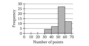
Draw a histogram for the following table which represent the marks obtained by 100 students in an examination:
|
Marks 0 - 10 10 - 20 20 - 30 30 - 40 40 - 50 50 - 60 60 - 70 70 - 80 |
Number of students 5 10 15 20 25 12 8 5 |
Solution :
The class intervals are all equal with length of 10 marks. Let us denote these class intervals along the X-axis. Denote the number of students along the Y-axis, with appropriate scale. The histogram is given below.
Scale :
X - axis = 1 cm = 10 marks
Y - axis = 1 cm = 5 students
In the above diagram, the bars are drawn continuously. The rectangles are of lengths (heights) proportional to the respective frequencies. Since the class intervals are equal, the areas of the bars are proportional to the respective frequencies.
Example 2 :
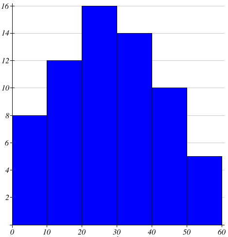
Draw a histogram to represent the following data
|
Class interval 0 - 10 10 - 20 20 - 30 30 - 40 40 - 50 50 - 60 |
Frequency 8 12 6 14 10 5 |
Scale :
X - axis = 1 cm = 10 units
Y - axis = 1 cm = 2 units
Example 3 :
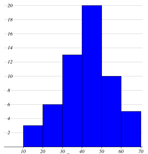
In a study of diabetic patients in a village, the following observations were noted. Represent the above data by a frequency polygon using histogram.
|
Ages 10 - 20 20 - 30 30 - 40 40 - 50 50 - 60 60 - 70 |
Number of patients 3 6 13 20 10 5 |
Scale :
X - axis = 1 cm = 10 age
Y - axis = 1 cm = 2 patients
Subscribe to our ▶️ YouTube channel 🔴 for the latest videos, updates, and tips.
Kindly mail your feedback to v4formath@gmail.com
We always appreciate your feedback.
About Us | Contact Us | Privacy Policy
©All rights reserved. onlinemath4all.com

Recent Articles
-
Digital SAT Math Questions and Answers (Part - 13)
May 10, 26 05:50 PM
 Digital SAT Math Questions and Answers (Part - 13)
 -
Problems on Solving Logarithmic Equations
Apr 24, 26 09:30 PM
Problems on Solving Logarithmic Equations -
Solving Logarithmic Equations Worksheet
Apr 24, 26 09:05 PM
 Solving Logarithmic Equations Worksheet