CONSTRUCTION OF BAR GRAPHS
Subscribe to our ▶️ YouTube channel 🔴 for the latest videos, updates, and tips.
There are two types of bar diagrams namely, Horizontal Bar diagram and Vertical bar diagram.
While horizontal bar diagram is used for qualitative data or data varying over space, the vertical bar diagram is associated with quantitative data or time series data.
Bars i.e. rectangles of equal width and usually of varying lengths are drawn either horizontally or vertically.
We consider Multiple or Grouped Bar diagrams to compare related series. Component or sub-divided Bar diagrams are applied for representing data divided into a number of components. Finally, we use Divided Bar charts or Percentage
Bar diagrams for comparing different components of a variable and also the relating of the components to the whole. For this situation, we may also use Pie chart or Pie diagram or circle diagram.
Steps to Construct a Bar Graph
Step 1 :
On a graph paper, draw vertical line and horizontal line which are perpendicular to each other.
Step 2 :
In the given data, you will have two variables. One of the variables to be taken on the horizontal line and other variable to be taken on the vertical line.
Step 3 :
The bars we take either on the horizontal line or vertical line should have uniform width.
Step 4 :
If we take the first variable on horizontal line, the bars should be drawn on horizontal line.
If we take the first variable on vertical line, the bars should be drawn on vertical line.
Step 5 :
The height of each bar will depend upon the data given.
Examples
Example 1 :
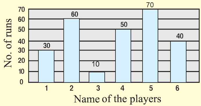
The total number of runs scored by a few players in one-day match is given.

Solution :
Draw bar graph for the above data.
Example 2 :
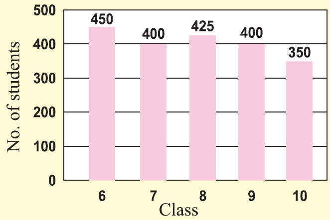
The number of students in each class of a school is given.
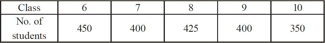
Solution :
Draw bar graph for the above data.
Example 3 :
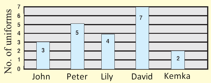
The number of uniform sets 6 th grade students have with them are given in the table.
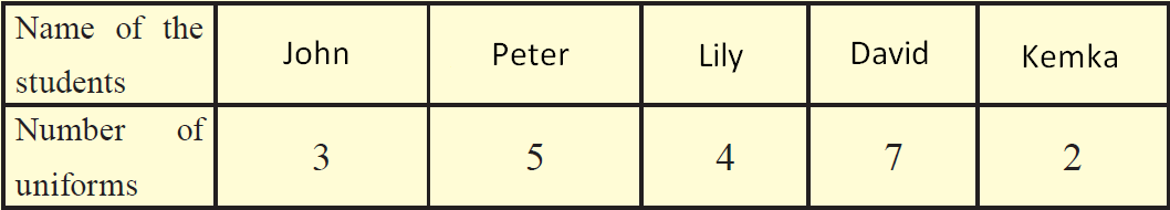
Solution :
Draw bar graph for the above data.
Example 4 :
The number of shirts produced in a tailoring unit in 6 days is given.
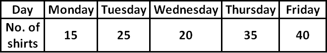
Solution :
Draw bar graph for the above data.
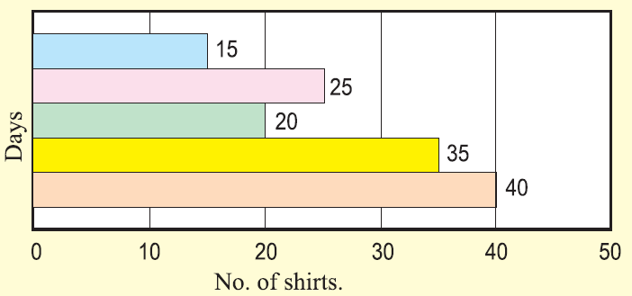
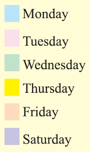
The color related to each day is given below.
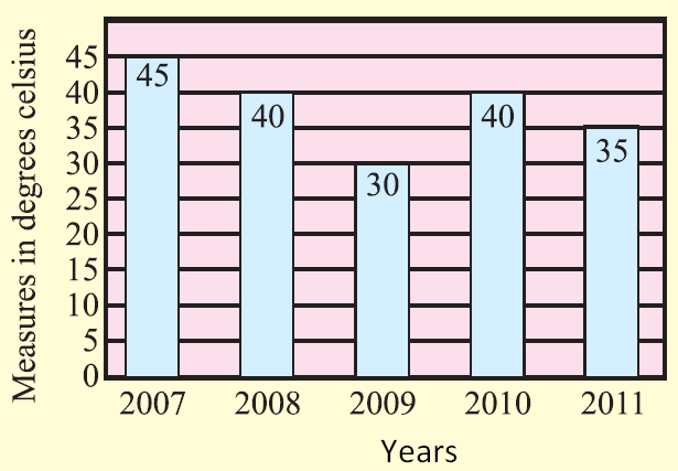
Example 5 :
The average temperature during the month of April in a city during the year 2007 to 2012 is given.
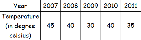
Solution :
Draw bar graph for the above data.
Subscribe to our ▶️ YouTube channel 🔴 for the latest videos, updates, and tips.
Kindly mail your feedback to v4formath@gmail.com
We always appreciate your feedback.
About Us | Contact Us | Privacy Policy
©All rights reserved. onlinemath4all.com

Recent Articles
-
AP Calculus AB Problems with Solutions (Part - 1)
May 29, 26 09:41 PM
 AP Calculus AB Problems with Solutions (Part - 1)
 -
SAT Math Practice Problems with Answers
May 21, 26 01:17 AM
 SAT Math Practice Problems with Answers
 -
Digital SAT Math Questions and Answers (Part - 13)
May 17, 26 09:03 AM
 Digital SAT Math Questions and Answers (Part - 13)