COMPARING DOT PLOTS VISUALLY
Subscribe to our ▶️ YouTube channel 🔴 for the latest videos, updates, and tips.
We can compare dot plots visually using various characteristics, such as center, spread, and shape.
Let us understand how dot plots can be compared visually through the following examples.
Example 1 :
The dot plots show the heights of 15 high school basketball players and the heights of 15 high school softball players.
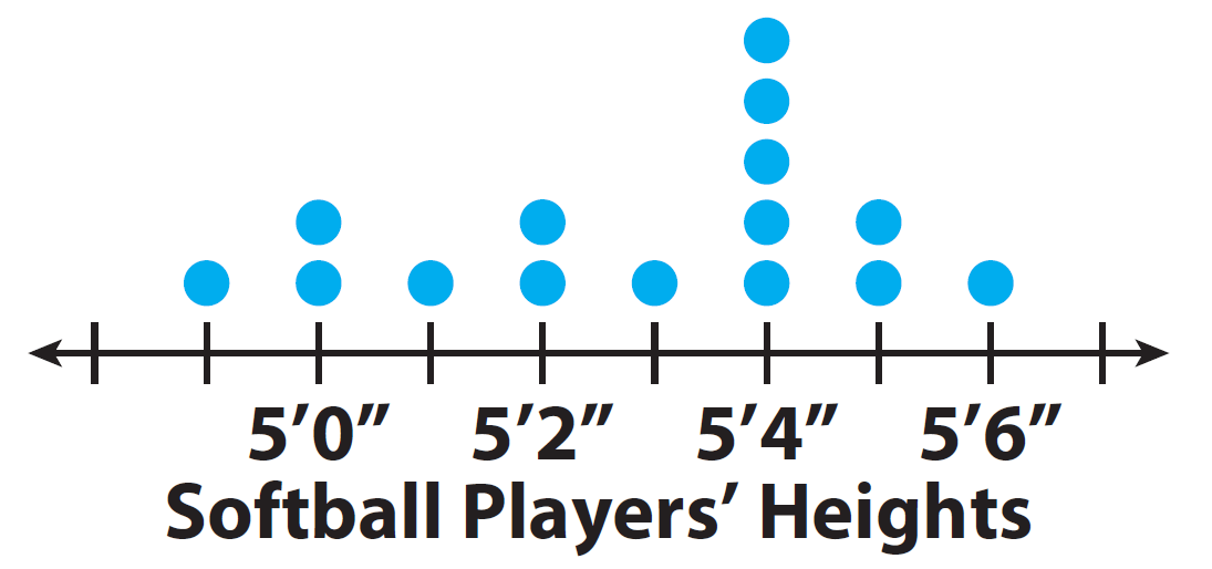
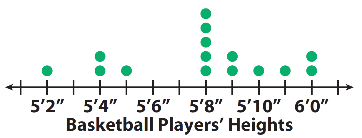
1. Visually compare the shapes of the dot plots.
Softball : All the data is 5’6” or less.
Basketball : Most of the data is 5’8” or greater.
As a group, the softball players are shorter than the basketball players.
2. Visually compare the centers of the dot plots.
Softball : The data is centered around 5’4”.
Basketball : The data is centered around 5’8”.
This means that the most common height for the softball players is 5 feet 4 inches, and for the basketball players 5 feet 8 inches.
3. Visually compare the spreads of the dot plots.
Softball : The spread is from 4’11” to 5’6”.
Basketball : The spread is from 5’2” to 6’0”.
There is a greater spread in heights for the basketball players.
4. Visually compare the dot plot of heights of field hockey players to the dot plots for softball and basketball players.
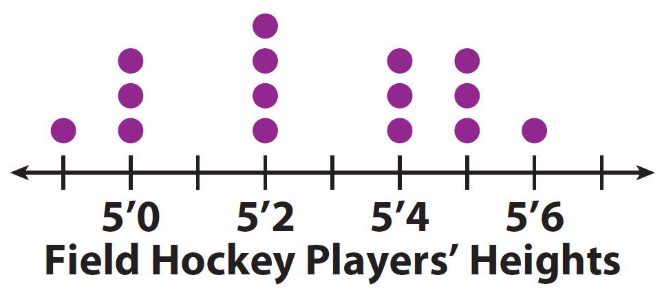
Shape :
Dot plots for field hockey players and softball players have a similar spread.
Center :
Center of the field hockey dot plot is less than the center for softball or basketball players.
Spread :
Dot plots for field hockey players and softball players have a similar spread.
Example 2 :
The dot plots show the shoe sizes of two different groups of people.
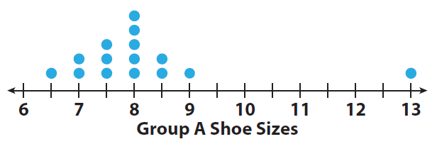
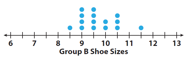
1. Visually compare the shapes of the dot plots.
Group A : clustered to the left of size 9 ;
Group B : clustered to the right of size 9
2. Visually compare the medians of the dot plots.
Group A : median at size 8 ;
Group B : median at size 9.5
3. Visually compare the ranges of the dot plots (with and without the outliers).
Group A : range with outlier = 6.5, without outlier = 2.5;
Group B : range = 3
4. Provide a possible explanation for the results of the dot plots.
Group A could be children and Group B could be adults.
Problem 3 :
Numerically compare the dot plots of the number of hours a class of students exercises each week to the number of hours they play video games each week.
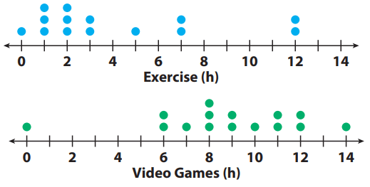
1) Compare the shapes of the dot plots.
2) Compare the centers of the dot plots by finding the medians.
3) Compare the spreads of the dot plots by calculating the range.
Solution :
1) Exercise: Most of the data is less than 4 hours.
Video games: Most of the data is 6 hours or greater.
2) Median for exercise:2.5 hours.
Even though there are outliers at 12 hours, most of the data is close to the median.
Median for video games: 9 hours.
Even though there is an outlier at 0 hours, these values do not seem to affect the median.
3) Exercise range with outlier: 12 - 0 = 12 hours
Exercise range without outlier: 7 - 0 = 7 hours
Video games range with outlier: 14 - 0 = 14 hours
Video games range without outlier: 14 - 6 = 8 hours
Problem 4 :
Calculate the median and range of the data in the dot plot.
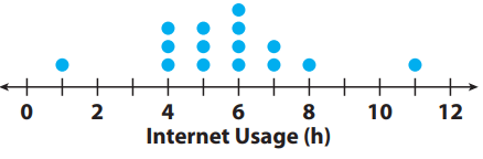
Solution :
Total number of values in the data set is = 15 (odd)
= (15 + 1)/2 th value
= 8th value
6 hours is the median of the data.
Range = Largest value - smallest value
= 11 - 1
= 10 hours
Problem 5 :
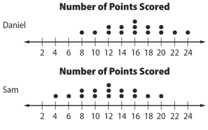
The double dot plot shows the number of points scored by Sam and Daniel in 15 basketball games. What is the difference between the medians?
Solution :
Total number of values of data set = 15
Daniel :
8th value is the median.
16 points is the median score of Daniel.
Sam :
16 points is the median score of Sam.
Problem 6 :
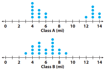
The dot plots show the number of miles run per week for two different classes. For 1–5, use the dot plots shown.
1. Compare the shapes of the dot plots.
2. Compare the centers of the dot plots.
3. Compare the spreads of the dot plots.
4. Calculate the medians of the dot plots.
5. Calculate the ranges of the dot plots
Solution :
1) Clustered around two areas in class A.
Clustered around only one area in class B.
2) Calculating center :
Class A :
4, 4, 4, 4, 4, 5, 5, 5, 6, 6, 12, 13, 13, 13, 13, 14, 14
Total number = 17 (odd)
= (17+1)/2 th value
= 9th value
6 is the center of class A.
Class B :
3, 4, 4, 4, 5, 5, 5, 5, 6, 6, 7, 7, 7, 7, 7, 8, 8, 9
Total number = 18 (even)
= Average of 9th value and 10th value is mean
6 is the center of class A.
3)
The spread of class A is in between 4 to 14 miles.
The spread of class B is in between 3 to 9 miles.
4) Median for both classes is 6.
5) Range of class A = 14 - 4 ==> 1 0
Range of class B = 9 - 3 ==> 6
Subscribe to our ▶️ YouTube channel 🔴 for the latest videos, updates, and tips.
Kindly mail your feedback to v4formath@gmail.com
We always appreciate your feedback.
About Us | Contact Us | Privacy Policy
©All rights reserved. onlinemath4all.com

Recent Articles


-
Digital SAT Math Practice Test with Answers (Part - 17)
Sep 15, 26 12:10 PM
 Digital SAT Math Practice Test with Answers (Part - 17)
 -
Digital SAT Math Practice Test with Answers (Part - 16)
Sep 07, 26 11:23 AM
Digital SAT Math Practice Test with Answers (Part - 16) -
Digital SAT Math Practice Test with Answers (Part - 15)
Aug 23, 26 12:24 PM
 Digital SAT Math Practice Test with Answers (Part - 15)